没有的产品在推车。
Tianyu Pavilion
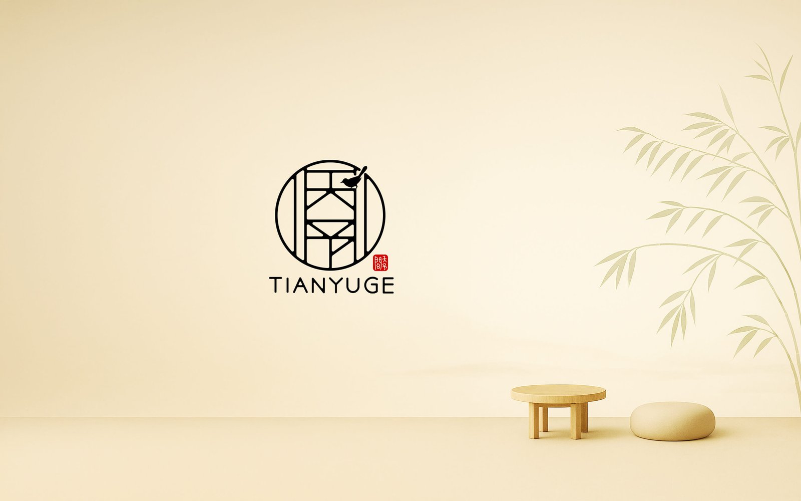
Tianyu Pavilion is a professional design studio based in Hangzhou, specializing in interior aesthetics and bespoke spatial solutions.
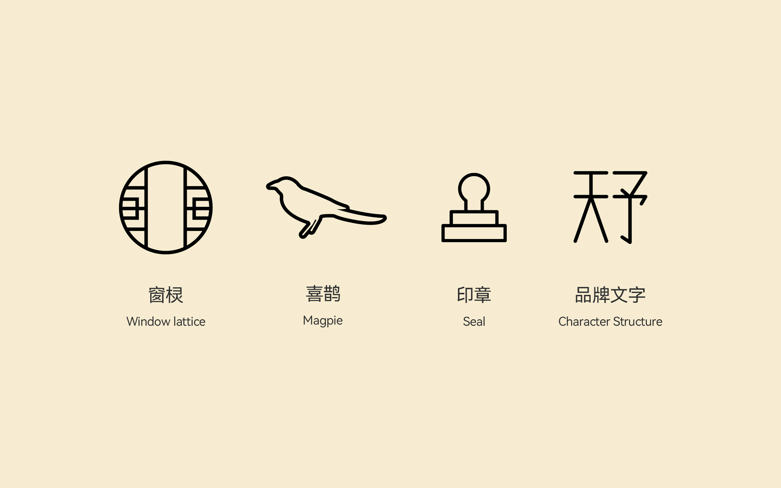
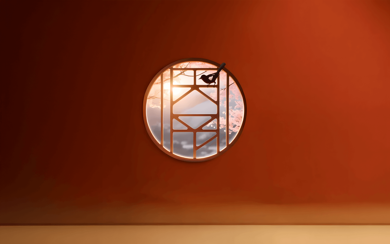
The logo draws visual inspiration from the traditional Chinese circular lattice window, reinterpreting the strokes of the name “Tianyu” into the structure of the window frame. Through a composition of symmetry and intentional negative space, the design establishes a distinctive sense of spatial order. The circular form symbolizes “heaven” (Tian) and conveys wholeness, harmony, and fluidity—echoing the brand’s core philosophy of “offering people spaces imbued with warmth and grace.”
Perched atop the lattice, a magpie breaks the rigid vertical-horizontal grid with its lively stance, injecting dynamism and vitality into the overall form. As a traditional symbol of good fortune, the magpie signifies “joy entering the pavilion,” reinforcing the brand’s cultural depth while suggesting that design is the prelude to a joyful life—emotion and environment interwoven, ushering happiness into the home.
The brand’s Chinese name appears in the lower right corner in the form of a red seal, which balances the composition with a bold color accent. This element not only pays homage to traditional Chinese design heritage but also conveys a sense of trustworthiness and authority. The entire logo system, rendered in a refined palette of black, white, and red, forms a stable and distinctly Oriental visual language—resonating with Tianyu Pavilion’s dedication to humanistic warmth in contemporary design.