没有的产品在推车。
QilaiMi
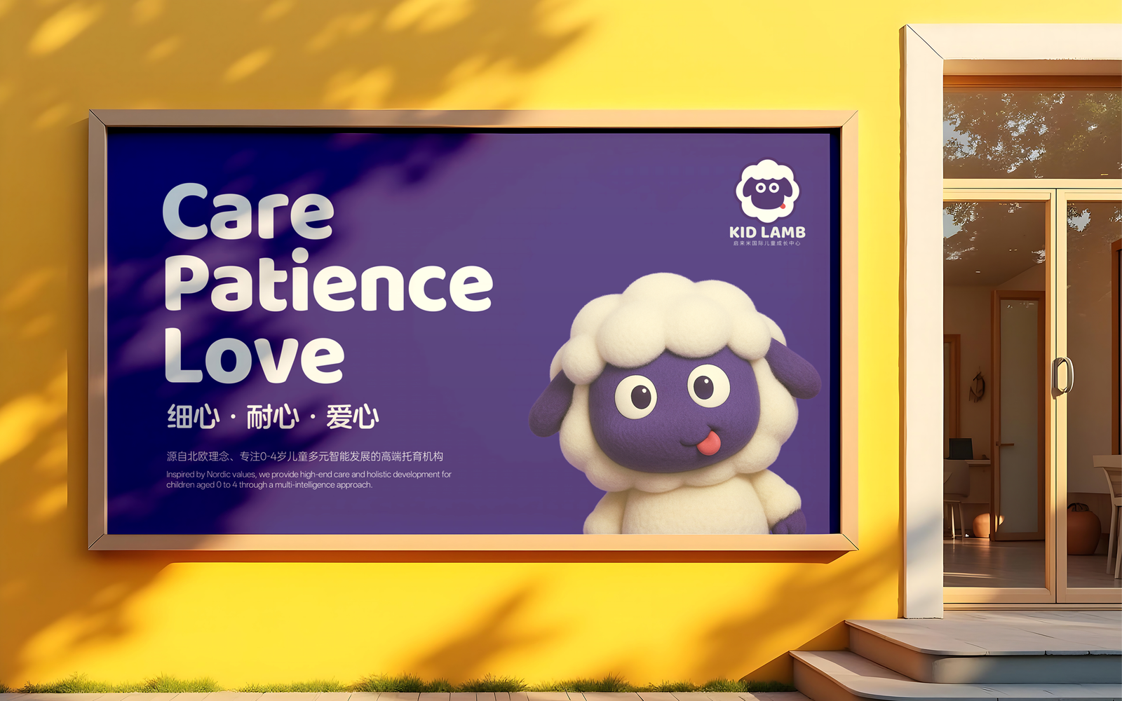
QilaiMi International Early Childhood Center is inspired by the Nordic concept of “happy education.” Its curriculum is based on Harvard professor Howard Gardner’s theory of multiple intelligences, focusing on the comprehensive development of eight core intelligences in children aged 0 to 4. Adhering to international standards of high-quality childcare, QilaiMi provides families with warm, professional, and trustworthy early childhood companionship.
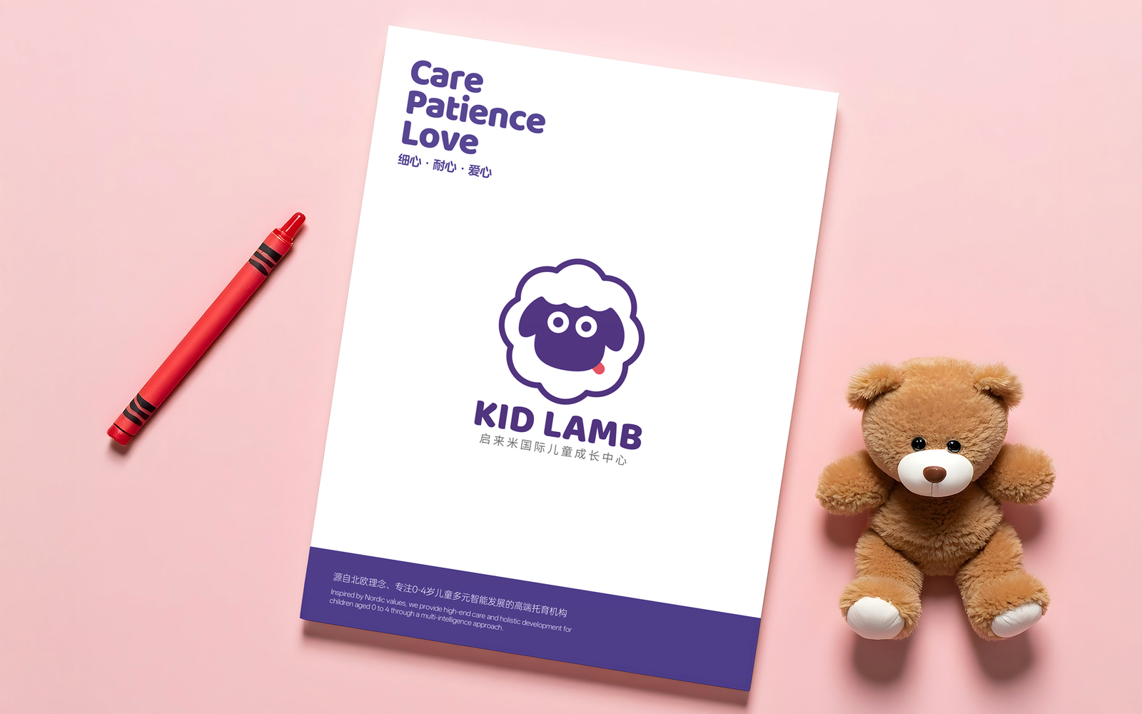
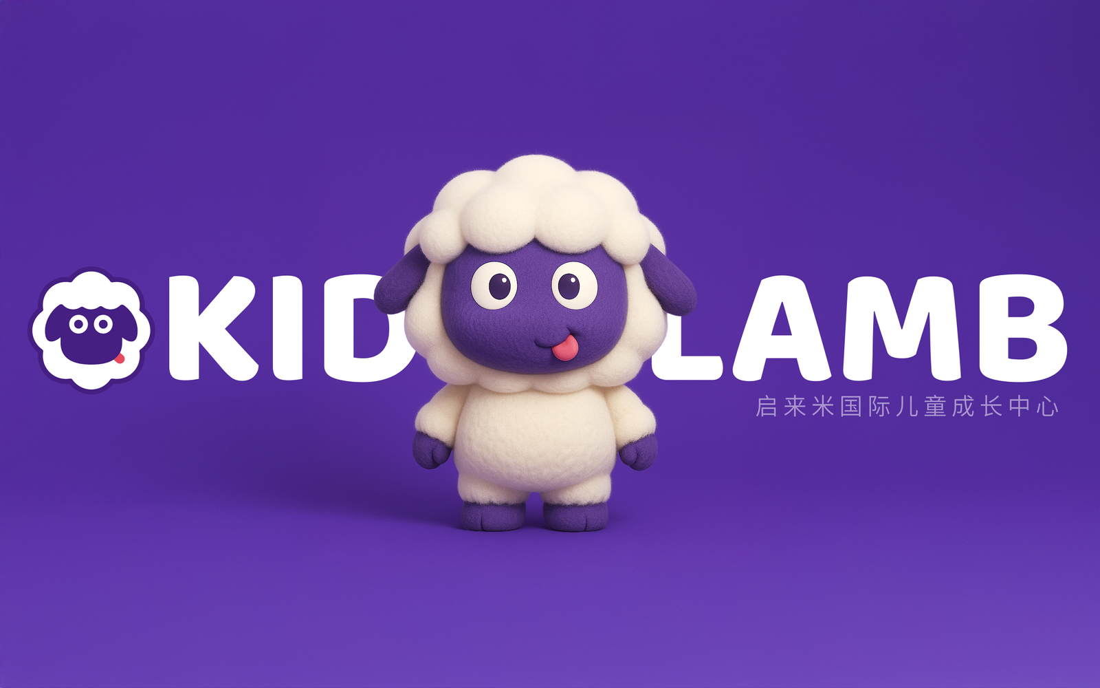
The logo takes “KID LAMB” as its creative foundation—referring to a “little lamb,” a symbol of warmth, innocence, and nurtured growth. The central figure is an endearing cartoon lamb designed to resonate with children’s emotions and convey QilaiMi’s mission to accompany and support healthy childhood development.
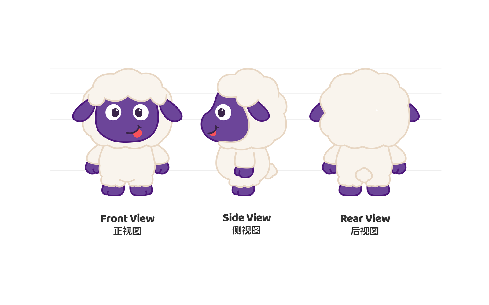
The outer silhouette adopts the shape of soft, full petals, symbolizing the idea that “children are the blossoms of the nation,” while also reflecting the brand’s focus on early education. The lamb’s face contrasts deep purple and white to ensure strong visual recognition—stable in form, yet full of playfulness.
The visual composition emphasizes symmetry while introducing intentional asymmetry through the tongue-out expression, creating a lighthearted and welcoming tone. The wide-eyed gaze enhances emotional connection with children and parents alike. The primary color of deep purple balances a child-friendly look with a sense of professionalism, reinforcing trust and brand quality.
Overall, the logo is clean, friendly, and highly adaptable across communication contexts. It visually expresses QilaiMi’s core values of “Nordic-inspired happy education,” delivering a warm and professional identity for early childhood development.